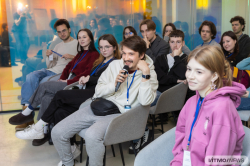
The WUD@ITMO conference coincided with World Usability Day, which has been internationally celebrated since 2005. This year, the main topic of the event was “Design for the Future That We Want”. WUD@ITMO was first organized by the Center of Usability and Mixed Reality (Faculty of Software Engineering and Computer Systems) in 2015. Since then, the event has been growing its audience and inviting new experts and collaborators.
In 2019, WUD@ITMO was organized by ITMO University together with the University of Tallinn and was supported by Arcadia, EPAM and Wärtsilä.
As noted by Artem Smolin, the head of ITMO University’s Center for Usability and Mixed Reality and one of the organizers of the event, each year the essence of the conference remains the same: first of all, WUD@ITMO is a platform where specialists in the field of interface design and testing can share their knowledge and opinions, as well as discuss the current trends and solutions.
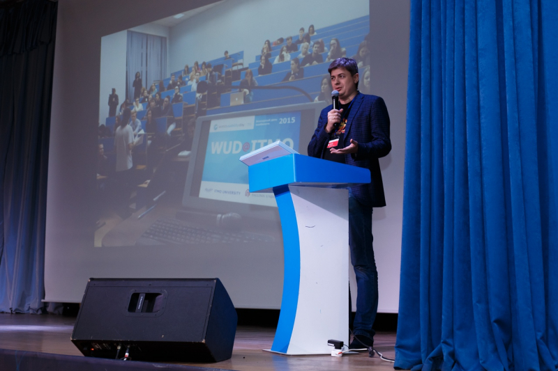
“Our main objective is providing communication. Every year we summon the UX/UI-community to highlight the key events in the field, share our experiences and talk to each other, meet new people,” says Artem Smolin. “We invite experts from different companies. Moreover, I am pleased to see some of our “Multimedia technologies, design and usability” Master’s program alumni among the speakers this year. They are now employees at various companies. We select the presentations and talks very carefully so that the conference covers some fundamental problems in the field while also tackling practical issues.”
WUD@ITMO annually unites experts from universities and major companies in the field. This year's program included speakers from EPAM, VK, Wärtsilä, MyOffice, iGMS, E.com and Usabilitylab.
Unusual design solutions: how to successfully create complex subject field interfaces
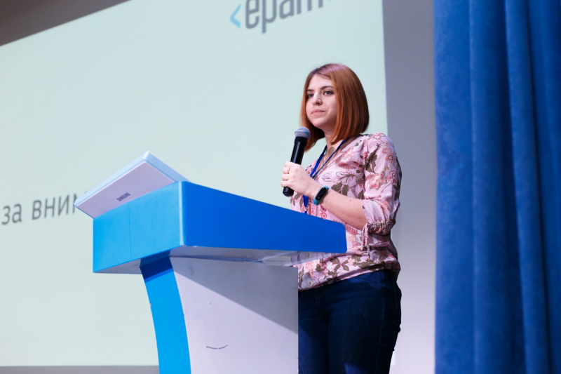
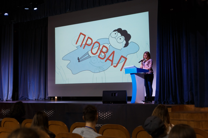
Ilona Sarkisova, a UX-designer at EPAM and an alumnus of ITMO’s “Multimedia technologies, design and usability” Master’s program, talked about potential problems with the design of complex subject field interfaces and offered some advice on how not to fail a difficult project.
Let’s say that you already are a rather good interface designer with several successful projects like online stores and mobile applications under your belt, but one day you decide that you want to try your hand at something actually serious. You keep looking for just such a project and end up at a major international pharmaceutical company. They need you to create a system for their chemistry lab assistants.
At first, you are equipped with the project documentation, and in a couple of days, they start asking you for tons of design solutions. What would you do? Most likely, you’d be lost like any other young specialist, who is stepping on an uncharted territory for the first time.
“It is difficult to understand what you have to do when you don’t understand the project itself. The majority of projects out there, like online stores and mobile applications, don’t have anything new to offer a designer. Naturally, each has its issues and unique users, but most of the time we don’t have to spend any time trying to figure out a particular project’s subject matter. Things are different when we consider difficult projects, like in my lab assistants example. In this case, we would first have to understand the subject field,” underlined Ilona Sarkisova.
For a designer, a subject field is any area of knowledge a user or a project lives in. Ilona Sarkisova recommends dividing this field into three major spheres. First comes specific user vocabulary. Second, any subjects and objects that need to operate inside the field (like the lab assistant in her example), and finally, it’s the connections between them.
When we enter a new field, we have to learn what each term means, and always be careful with the familiar terms that might mean something different in a new context. Subject field knowledge is a major boost at the very first stage when a designer is only outlining possible user behavior.
But how does one quickly and effectively study the subject field?
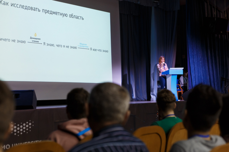
According to Ilona Sarkisova, any researcher goes through four distinct stages. “I know nothing”, “I know what it is I need to know”, “I know something” and, finally, “expert”. The last one is hard to reach, it takes years of studying and research, so a designer has to focus on the first three.
Step 1. From “I know nothing” to “I know what it is I need to know”
You can make this transition by reading at home. Read the project documentation, and check up the terms that you don’t understand, visit some professional forums online to look a little deeper, and study the systems that are already on the market.
At first, you’d have to deal with a tidal wave of information you can’t comprehend, but this research will help you understand the structure of the subject field. Just remember: you need to learn enough for you to be able to ask the right questions.
Step 2. From “I know what it is I need to know” to “I know something in the subject matter”
As soon as you come up with these questions, it gets hard to keep them in your head. That is why we have project documentation. Any designer knows what artifacts are. These are not the same as in the field of video games. Artifacts are files, blueprints or diagrams created by a designer.
“What can we create to study the subject field? A dictionary and a subject-connections model. These are simple artifacts that you can make on the go to structure the information that you have and so as not to forget something. Your dictionary may be a simple table with the key terms and a couple of details. On this step, you will usually come up with questions that you can now ask someone who is more competent in the field. It means that it is high time to start talking to the experts,” continues Ilona Sarkisova.
Who can be an expert? First of all, these are your colleagues on the project (managers, business-analytics), who have been working on it longer and can help you with the details. But they can only cover a part of your questions, and you will have to find questions to all the others by talking to users themselves as well as your main stakeholders, chemists if we go back to my example. You have to address all of your specific questions to them. Their answers will then have to fill in the gaps in your artifacts, giving you the whole picture.
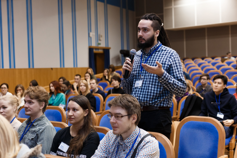
Getting to communicate with your experts and see them work helps a designer to come up with effective solutions, and see eye-to-eye with their clients and users.
Useful tips from Ilona Sarkisova:
- Always remember you are not an expert;
- Be proactive, and remember that it is your duty as a designer to study the subject matter. No one will simply share their knowledge with you;
- Write it down. Make notes. Don’t forget about the language, the subjects and the connections between them.
Apple and Google aren’t always right: why you can't just blindly follow the trends
Alexandr Ovcharenko, UX Lead at Wärtsilä Digital Technologies, presented the latest well-known trends in interface design, and explain why you shouldn’t always follow them. Wärtsilä is the leading supplier for the energetic and shipbuilding markets in Russia. In line with this specialization, Alexandr turned to marine-themed metaphors in his talk. How does a dangerous sea differ from a safe one? It doesn’t at the surface if you don’t look deeper. It works the same with mass product usability. We risk losing something important if we follow the trends without looking deeper.
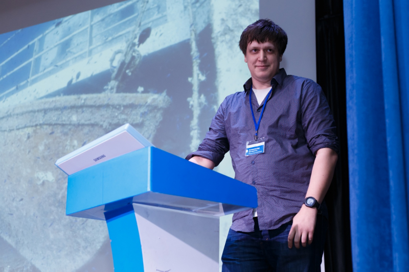
Alexandr Ovcharenko drew a couple of examples demonstrating that sometimes even popular solutions of major companies that are considered in trend right now can be proven effective. One such example is an issue with several iPhone models: when you swipe to close the app, you also accidentally change the brightness setting. All of the trendy minimalist solutions in weather visualization applications are also not as effective as they should be. It is often the case that now the user cannot access an important part of the information that used to be present at the screen, in a form that might not have been as pleasant to the eye, but was still clear and readable.
He notes that the issue is made worse by the fact that these days many people and even specialists in certain fields rely 100% on what they see in their system or application. This trend has recently forced the officials of Baunei, Italy, to put up signs saying “Do not follow directions suggested by Google Maps”. In 2019, 144 people were rescued by the town’s emergency services. Tourists, staying on Sardinia, follow the Google Maps down to the impassable roads of the region, and then cannot find a way back on their own.
“Relying on machines and systems is a trend, while experience tells us that the more complex a situation, the less you should trust them. Thus, if we come back to the sea metaphor, there is one conclusion to make: look out for any hidden reefs. Trends are not unlike surface currents, they are not good or bad. Sometimes you should follow them and sometimes you shouldn’t. But if we follow them blindly, we risk finding ourselves on the bottom,” concluded Alexandr Ovcharenko.
The next WUD@ITMO is planned for November 14, 2020, stay tuned for more information.


