What is foresight and open-mind thinking
Though it is represented differently in different cultures, space has always been a part of the human world. Open any medieval astronomy book and you’ll see the horizon there, in some form or another. However, all these perceptions of space changed dramatically in the 1960s with the start of the age of space travel. The thing is that when in space, we lack some important things, for example, the frame of reference. Remember X, Y and Z from your school lessons? Thanks to them, we understand where we should build a house and how to make it three-dimensional. We don’t have them in space. From the architectural standpoint, where are the walls, and floor, and ceiling?
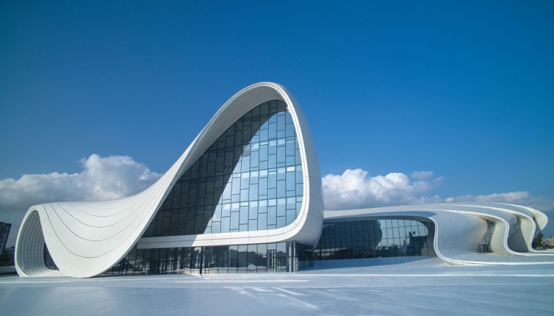
In the ‘60s, people start to think about the design of objects that will be used in the space era. The thing is that back then, people were convinced that in ten years, it would be possible to take a bus to Earth’s orbit, but couldn’t come up with a way to bring these dreams into life. That’s when foresight specialists and architects take the stage, that is people capable of thinking outside of the box. The visionary Zaha Hadid is one of the leading examples.
Disneyland and General Motors
The Monsanto House of the Future was one of the first projects in the spirit of “I Want to Live in Space” motto. Acting as an attraction at Disneyland’s Tomorrowland in Anaheim, California from 1957 to 1967, it offered a tour of a futuristic home, and was intended to demonstrate the versatility of modern plastics. Its main defining feature was that it was designed with the concept of position of light left out of the picture. Tasked with creating a modern building, we usually have to reflect on how the sun moves across the sky, where the north side is, as well as the south, west, and east, and what the insolation, or the level of illumination of the lower rooms, will be, to meet all the biomedical standards for the people who would live there. But all these limits that we place on architectural planning on Earth are removed in the case of space design.
The project was created by a big group of architects and foresight specialists who explored a multitude of different aspects, one more peculiar than the other. For example, what happens with materials in space? Dragging trees to the near-earth orbit didn’t seem very possible. Was plastic a better option, then? But where was it to be manufactured? Moreover, each type of plastic has an operational lifespan after which it starts to flake. These are the sorts of questions that ‘50-60s architects had to think about.
The project was, of course, a speculative one: this architectural kind is founded on concepts that can’t possibly be implemented in practice. But with that being the case, what was behind the main idea of Monsanto, and also its popularity? The fact is that the US creatives wanted to make the public used to living in the new environment even before they would find themselves in the great beyond of outer space. The task of coming to terms with living in small squares, circles, spheres or cubes would be made much easier provided that there was a shift in the very notion of how objects were to be designed. And then the future would be rainbows and smooth sailing.
The next project which was supposed to make the public accustomed to the idea of living on some hypothetical orbit with no conventional urban niceties such as shops and supermarkets was Motorama. Aired in 1957, this was a series of commercials funded by General Motors. The main idea behind them all was to illustrate the life of people of the future. For instance, the example below follows a young lady as she attends a General Motors exhibition, discovering various quirks from the future including an avant-garde kitchen where all the dreaded household chores are automated and the machines would do everything for her.
The most important themes recurring throughout the sixties were: we should not be tied to the normal system of coordinates (the fewer the standards the better), and everything should be either as automated as possible or have such forms that do not require modularity.
Organic transportation and new materials
Some 20th-century architects were of the belief that in the future, humankind may well become obsolete because of all the gadgets and appliances doing all the work. So they saw is as their creative responsibility to form such an agenda that would help people find meaning beyond the devices.
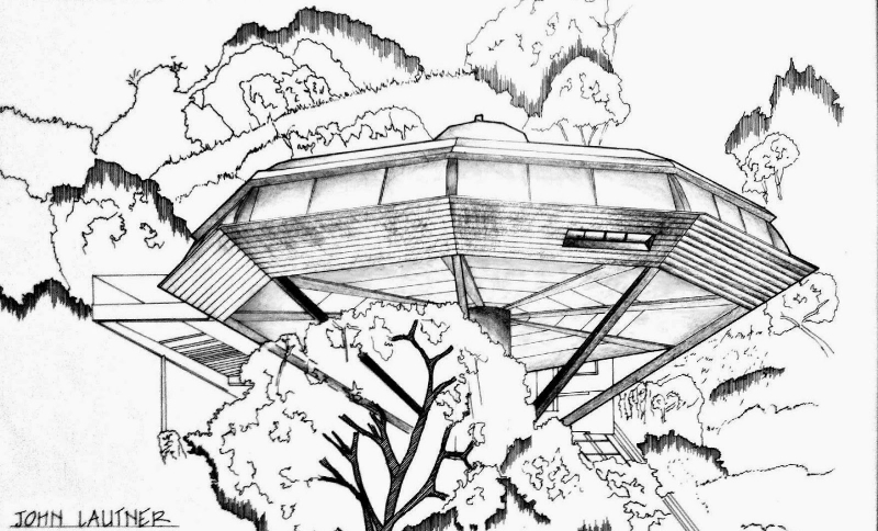
This was the case in the works by John Lautner, who decided to go beyond the trite notion of cars and boxes taking people places, instead coming up with the idea of the chemosphere which would travel from planet to planet with passengers dwelling snugly inside. The main task of the architect was to develop the apposite interpretation of the idea of foundation. His structure has nothing that would be binding it to a certain surface; instead, it would gel well with any landscape it happened to interact with thanks to a special kind of spherical stylus serving as its core. But this project also remained a speculation since it couldn’t go beyond the materials that existed in the ‘60s.
There was, however, a major leap in materials development as a result of the Second World War, which brought about progress in the prototyping of a variety of lightweight materials which were for the most part used in constructions of bomber aircrafts. After the war, these materials went on to be used in space programs of the US and the Soviet Union, and also to create new objects for day-to-day household design.
That’s why the chemosphere drew from the materials developed in the ‘40s, trying to harness the technology to the max. This was one of the first projects to start thinking about resource efficiency, but the creators weren’t that concerned with the idea of the protection of the environment: the driving force here was the perceived possibility of humanity finding itself on a planet with no petroleum.
Vegetation and UFO in Seattle
Chemospheres failed to become popular, but the 1960s saw new objects that were novel in terms of a variety of architectural standpoints. People latched on to everything related to space. UFOs is one example: everyone somehow decided that it would be formed as a disk, to much bewilderment of all foresight specialists up to this day; no one knows the reason why we decided to draw our spaceships that way.
A great example of UFO-style architecture can be found in Space Needle, Seattle’s TV tower. It has a very interesting silhouette, its core being very similar to that in Lautner’s chemosphere project with the plate resting atop it. In fact, the whole construction looks like the chemosphere, only a very elongated one. Like many television towers in America and Europe, it has become redundant now, what with the universal shift from analog to digital TV. We’ll soon have to think about what to make of our own Ostankino Tower in Russia. The Seattle Tower has fallen victim to the same fate, though it’s still a very important symbol of the city.

Signed by the US architect William Pereira, Geisel Library in San Diego is another interesting project that is progressive even by modern-day standards. Let’s imagine that we’ve found an exoplanet that has all the things we humans need for our survival: flora, fauna, photosynthesis, all the processes we have on Earth. Underpinning Pereira’s thinking was the idea that when a hypothetical space object finds itself in a new environment, we will have to give the local nature an opportunity to conquer it, molding it into its own. The lower foundation of Pereira’s library contained architectural details which would allow the vegetation to creep into the building. As the known fact goes, if plants are given an opportunity to creep into something, they will, whatever the media.
Pereira wanted to open the dark, burnt out construction to nature, which has the capacity to digest and swallow the object. He believed that we shouldn’t be changing territories as we see fit; on the contrary, we should be aiming towards integrating into the biological processes that are happening there.
But some of the projects were more modest, revolving around the idea that the first settlers would above all else be colonizers, finding the solution to their primal, elementary needs in the structure of monoboxes. The main tasks that arose from that were modularity and prototyping; much as with Lego blocks, each new detail was meant to fit with the preceding one. With that in mind, the brutalist architects of the ‘60-70s found their ideal in the concept of a container street.

Until the time colonists fully understand the dangers of their new environment, they won’t have the chance to develop a new infrastructure around them. That’s why colonies should be created in the spirit of buildings by Alison and Peter Smithson. The garden building for St. Hilda’s College at the University of Oxford is a striking example of that. Put up by students with materials that were accessible to them, the creation brought to home the realization of how to be more sparing towards the environment and its resources.
The Japanese and St. Petersburg stadium
Who was the fastest and daring to move into this new direction? The Japanese: they are known for their comprehensive, admirably abstractive thinking. While American architects remained the successors and in many ways prisoners of the German architectural school, the Japanese managed to shy away from European influence and maintain their abstractionist tradition. A shining example here is Kisho Kurokawa’s Nakagin Capsule Tower, which uses the same modular containers.
We are of course acquainted with Kurokawa from his other creation: the Gazprom arena football stadium. Unfortunately, this grandiose project went on to be implemented not in its fullest, original scope. The author’s plan was to make the stadium a kind of starting point, a reference mark for a new space and city. In general, architects have to not only plan an object when working on a project; they have to analyze all the surrounding spaces from which their object would be seen. Landscapes, visual lines, movement infrastructure, the number of inhabitants; everything in these spaces tends to change. What was brought to fruition in Kurokawa’s case was only one object, and with a huge time gap too. Had we built Zenit Arena in the ‘60-70s, Soviet Union would have had swarms of tourists lining for visas to get there: the architecture in question was forward-looking to the extreme. But it seemed rather passé for 2017, missing the mark by 47 years.
Space in small objects design
Strange though this may sound, all the objects in the ‘60-70s design prototyping are round in shape. The best ergonomics-wise, the latter was considered as much of an organic fit into a normal, zoned rectangular space as it would be in the interiors of any rounded spaceship. What is more, it is in that era that designers started to think how to add maximal comfort into the interior space, not only in terms of the objects landscape but also the visual and sound picture.
Apollo 711 marked a very important milestone for the ‘60-70s American aesthetics. So much so that you can see it branded on almost all interior photography memorabilia of the time. Having that rather highbrow aesthetic and design appeal, it did nevertheless manage to win the hearts of regular households, which is proven by the fact that it was a recurrent fixture in American House, a popular interiors magazine.
Another example that presents itself is a creation by the company Telefunken, which is still in operation today. It focused its concepts on celestial objects humans can bump into upon leaving the planet Earth: comets, asteroids, meteorites and the suchlike. The company believed that in the future, earthlings would have to operate in visually new iconographic types, or characteristics and elements. For example, that humans would have to start to cognize the beauty of nature’s lines not through the crowns of trees but with the help of other, rather more novel, objects. The whole visual culture of humankind, posited Telefunken, would have to be recreated from scratch and accordingly to the images present in space. The company was very much concentrated on cultivating new visual habits.
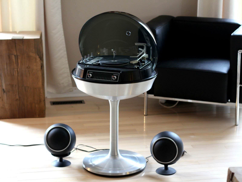
One of my most favorite projects in this cohort is Audio Egg by the company Panasonic. In the 1970s, responding to the necessity to bring music and radio directly into the household, engineers decided to develop a bifunctional object encompassing an entire medium of sound perception. This means of sound transmission was envisioned by them to be the most comfortable for all participants in the process: those sitting inside the room, those who entered the room by chance and those dwelling next door.
The Soviet perspective
Then why, if Yuri Gagarin was the first man in space, is the discourse around space age only include the architecture and design of the US, Japan, or Italy? The USSR had its own developments, too, especially in everything that was to do with materials science, as we were some of the most progressive thinkers in terms of material. We had our own leaders, too, it’s just that they were state institutes and not architectural bureaus. The VNIITE, for instance, worked in the field of creative engineering (the Soviet euphemism for “design”). Its staff had access to every foreign magazine and, thus, had a good understanding of what was happening in the object design world beyond the Soviet border. For that reason, many Soviet-made projects were created in the fashionable space-age style and were identical in their intentions, qualities, and variety to their Western counterparts.
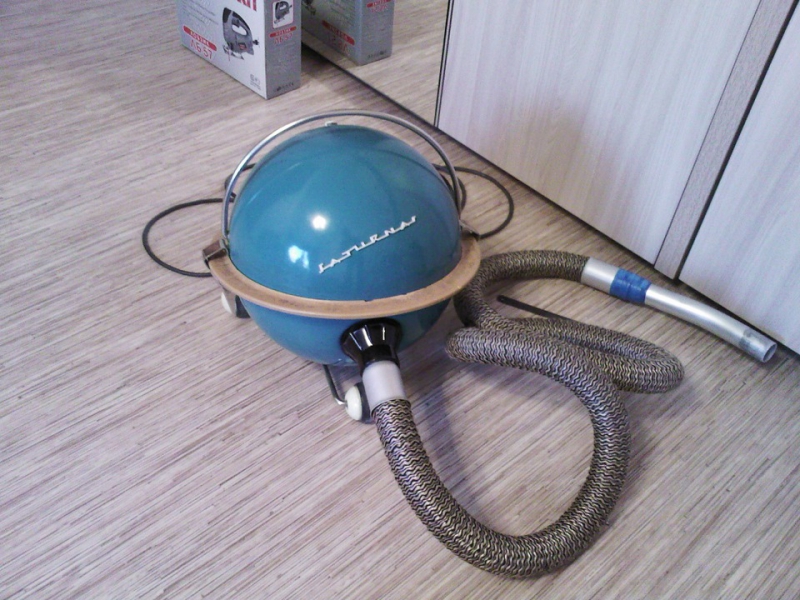
Take, for example, the cosmic vacuum cleaner Saturn with a noise-canceling system. Researchers still can’t figure out what came first: this or its Western twin called Hoover. What we do know is that Saturn was easier to use; it had a mobile construction with wheels, while the Hoover had a very unfortunate tube placement.
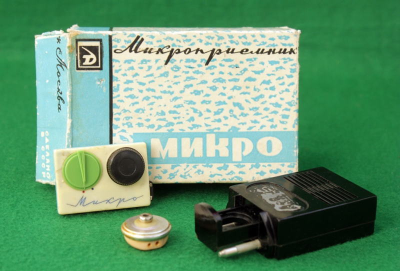
There was also a project that was highly progressive on a global scale, the Soviet transistor radio Miсro. This was the world’s first compact sound system. Today, when we put on our iPhone earbuds and take in the soundscape, we should be grateful to the Soviet engineers and foresight designers. At that point, the American and German sound industries only began exploring home audio, while our engineers ventured into the world of individual wearable radio. Unfortunately, it was not widely available to the Soviet public and could not be bought at a regular store.
It was, however, wildly popular abroad. Here’s a known fact: the currently reigning English queen had used a Micro when she went on walks with her corgis. It was a gift presented to her by a Soviet delegation. In the West, the device was, obviously, quickly taken apart by engineers and similar devices soon appeared on the market.
Conclusion
Though a great deal of spacefaring nations took part in writing the space age era on equal footing, Western space design ended up receiving the most recognition nowadays. It has become the topic of a whole plethora of books, which discussed all the bureaus, the manufacturers, the architects. Whereas not a lot of people in Russia know about the existence of Mikro.
Huge credit in this regard goes to the Moscow State Stroganov Academy of Design and Applied Arts, Strelka Institute and Moscow Architectural Institute. They are now doing the herculean task of popularizing the accomplishments of Soviet designers. Faced with more restrictive conditions and stricter prototyping requirements, you begin to look very far ahead. And now, I think, we will see the personalities of the ‘60s space foresight world entering our current intellectual discourse.
What is left from the ideas set forth by all the designers and architects? Quite probably, the concepts of ergonomics, new materials, new spaces. Analyzing how the architecture of today looks and what direction it is heading to, we have to declare that the foresight thinking of the space age era left a defining impact on its visual outlook.
I often repeat to my students “You have stopped fantasizing, you have stopped dreaming”. In 50 years, living will be rather boring for people. The things we are obsessing over today, the way our cars, coffee machines, living objects look like is the result of foresight thinking by architects and designers of the space age era. If today we don’t dare to be as provocative, surprising and intelligent as people of the space age era were, our descendants will end up living in white cubes and polygonal squares with a very underdeveloped coordinates system.


