
You Could Have It So Much Better by Franz Ferdinand
Year of release: 2005
Country: UK
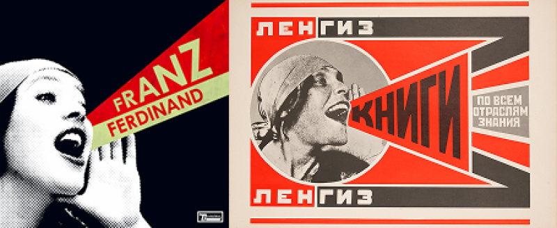
(Left) The cover art for the album You Could Have It So Much Better by Franz Ferdinand. Credit: en.wikipedia.org. (Right) The 1924 poster for the Lengiz Publishing House by Alexander Rodchenko. Credit: en.wikipedia.org
Coming from an art background, the members of this indie-rock UK band show a strong affinity for Soviet-era references, from their homage to 1920s avant-garde and propaganda artwork to tributes to banned literary works of that time (for one, their song Love and Destroy was inspired by Mikhail Bulgakov’s Master and Margarita). Most notably, the cover of their follow-up album You Could Have It So Much Better, which went platinum in its time, is an evident nod to Soviet propaganda posters, specifically the famous Constructivism-style advertisement for a publishing house, which was created by artist Aleksandr Rodchenko in 1924.
The Man-Machine by Kraftwerk
Year of release: 1978
Country: Germany
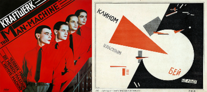
(Left) The cover art for the album The Man-Machine by Kraftwerk. Credit: en.wikipedia.org. (Right) The 1919-1920 poster Beat the Whites with the Red Wedge by El Lissitzky. Credit: Russian State Library / Wikimedia Commons / CC-PD-Mark
Way ahead of their time, this German electronic band went on to become a massive influence on a staggering number of music genres – from techno and synth rock to hip-hop – and demonstrated a penchant for experimentation, including their cover designs. One example is their seventh album titled The Man-Machine. A combo of black, white, and red colors, geometrical, non-natural lines, the font choice, the multi-language title, and reflections on human-machine relations – all these elements allude to the traits of Constructivism and, once again, the works of Alexander Rodchenko.
Gruppa Krovi by Kino
Year of release: 1988
Country: Russia
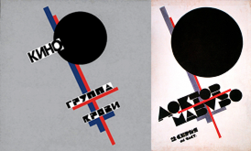
(Left) The cover art for the album Gruppa Krovi (Blood Type) by Kino. Credit: en.wikipedia.org. (Right) The 1925 release poster for Dr. Mabuse the Gambler (1922) by Kazimir Malevich. Credit: Wikimedia Commons / PD-Art
Gruppa Krovi, or, if translated, Blood Type, is arguably the most iconic album by the cult rock band Kino – and also in the USSR's musical history. As fellow artists, the band members allegedly sought inspiration in suprematism (simply defined as ”the supremacy of the color”), which was founded by Kazimir Malevich, the author of the infamous Black Square. In fact, the band adapted Malevich’s poster for Fritz Lang’s film series about Doctor Mabuse, but changed the headline. The original poster is currently exhibited at the Tretyakov Gallery.
Ride Blue Divide by Sniff 'n' the Tears
Year of release: 1982
Country: UK
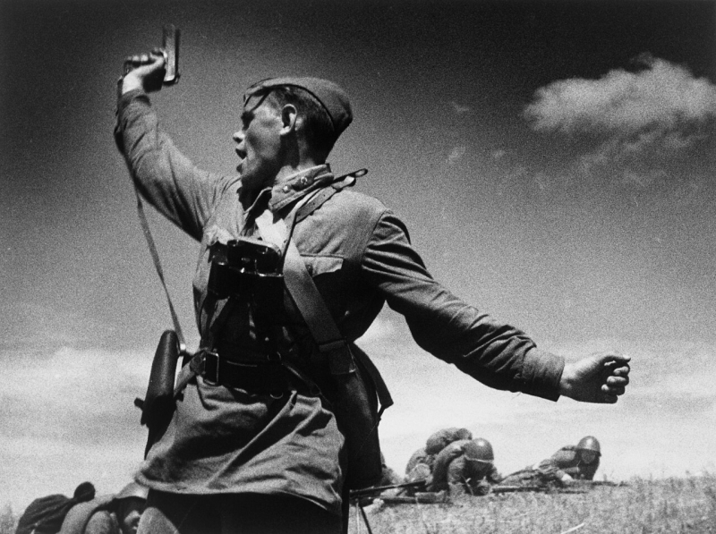
The 1942 Kombat photo by Max Alpert. Credit: RIA Novosti archive / Wikimedia Commons / CC BY-SA 3.0
While their debut album and particularly Driver's Seat brought fame to this London-based new-wave band, Ride Blue Divide is the one that demands more attention – not only music- but also art-wise. Other than being designed by the lead singer himself, the window landscape doesn’t have anything out of the ordinary to it. Yet, on closer inspection, one can notice a TV broadcasting one of the most powerful photographs of WWII, taken by the Soviet photographer Max Alpert. Notably, the album was released into a rather charged atmosphere: before the band’s ten-year hiatus and in the final years of the Cold War.
Six Compositions: Quartet by Anthony Braxton
Year of release: 1982
Country: USA
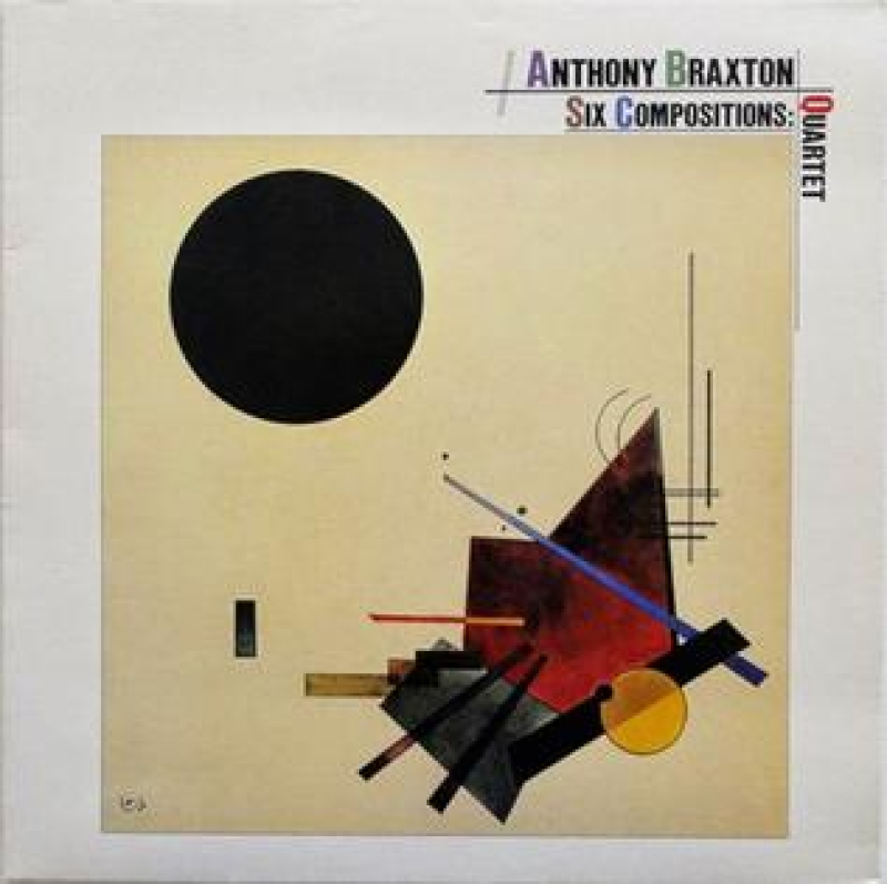
The cover art for the album Six Compositions: Quartet by Anthony Braxton. Credit: en.wikipedia.org
Being partial to the concepts of abstract art and creative chaos, free jazz pioneer Anthony Braxton (born in 1945) frequently features Wassily Kandinsky’s paintings on his record sleeves. The painter’s abstract artworks grace the covers of at least four albums of the composer, including his 1982 record Six Compositions: Quartet. For this album, Braxton opted for Kandinsky’s The Black Relationship (1924, Museum of Modern Art, NYC).
Hungry for more stories about art, music, and Russian culture – all at once? Browse the Life in Russia section on ITMO NEWS to find your next great read.