Becoming a global research and education center
ITMO was founded in 1900 and changed its strategy, names, and design several times. In the 20th century, it was a flagship of research in optics and laser and technologies. That’s where Yuri Denisyuk, the father of Russian holography, studied and worked. As of now, ITMO University is among the best Russian universities in IT and its students won the largest and most prestigious programming championship ICPC seven times, which is an unsurpassed result.
In the new millennium, the university started to develop new fields, such as chemistry, bioinformatics, biotechnologies, materials science, and more. Now it’s among the national leaders in a range of specializations. For instance, it leads the Shanghai Ranking among Russian universities in seven categories.
Previously, ITMO changed its design in 2014, when it positioned itself as a modern institution that is integrated into global science and education. This concept was mirrored in its slogan: IT’s MOre than a UNIVERSITY. As of now, the university’s staff is getting ready for new big changes, as in 2021 ITMO became a leader of the Priority 2030 program and presented its own 2030 Development Strategy titled Open-Source University.
ITMO today
Changes that the university underwent in the past eight years lie in the foundation of the new strategy. During this time, ITMO broadened its network of industrial partners. For example, together with Russian Railways, the university works on the first quantum line from Moscow to St. Petersburg, while jointly with Gazprom Neft, ITMO University is creating an innovative industrial center that will develop sensors, robots, drone control systems, computational systems, and other digital solutions for the oil and gas industry. Moreover, Gazprom Neft helped launch the Center for High-Tech Chemistry at ITMO, where over 150 cutting-edge studies will be conducted.
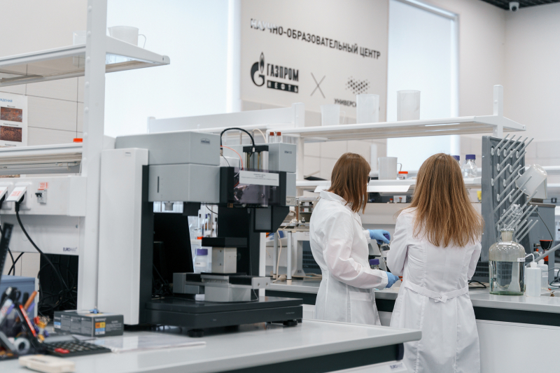
Center for High-Tech Chemistry. Credit: Gazprom Neft's press office.
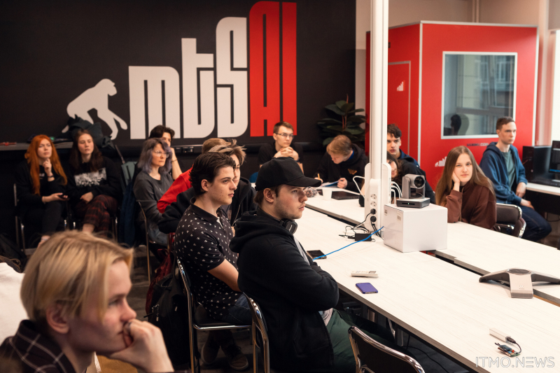
MTS AI lab at ITMO. Credit: ITMO.NEWS.
The educational programs have also changed: the university focuses on corporate programs with major companies, such as Yandex and Gazprom Neft, and works on new formats jointly with EdTech companies. For example, ITMO launched the Product Design Master’s program together with Netology and Machine Learning Engineering together with Napoleon IT.
Business processes and environment are also changing. ITMO opened the Student Services Office and Staff Support Office that solve a wide range of administrative tasks, as well as made other changes to enhance the workflow and communication between students and staff.
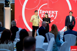
“ITMO is truly becoming a non-classical university. The ongoing changes bring us closer to becoming a modern IT corporation that branches into a range of various products. In the past few years, ITMO University broadened and launched new programs and projects, which helped it become important in the business world thanks to the science-driven technologies, R&D centers, and culture. All this motivates us to develop further according to the new model. We know ITMO is more than a university – it’s a super app integrating a number of products and fields. It’s not just about IT, it’s a researchand educational corporation that brings together the fundamental approach and brand-new products,” says Kirill Alexandrov, head of the Strategic Communications Department.
Credit: ITMO.NEWS.

Credit: ITMO.NEWS.
Credit: ITMO.NEWS.
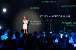
The concept of a research and educational corporation brings together several ideas: education that helps students start a career early on, academic freedom that makes it possible for scientists to research comfortably, and a modern approach to workflow, management, and startups for those who are focused on business.
For ITMO.Family, openness is the most important aspect, as it means that everyone is free to share their ideas and receive support. It stands for a lifestyle that takes care of every member of the community in terms of their mental health and the surrounding environment.
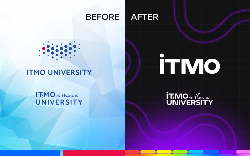
New logo
Credit: MegaByte media.
These ideas are represented by the new design, created by the Strategic Communications Department. The slogan remains the same – IT’s MOre than a UNIVERSITY – because despite becoming a research and educational corporation, the university part lies in the foundation.
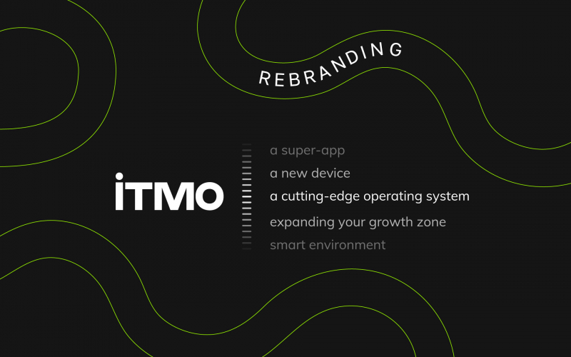
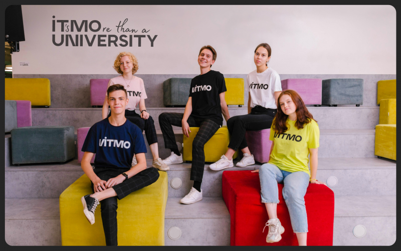
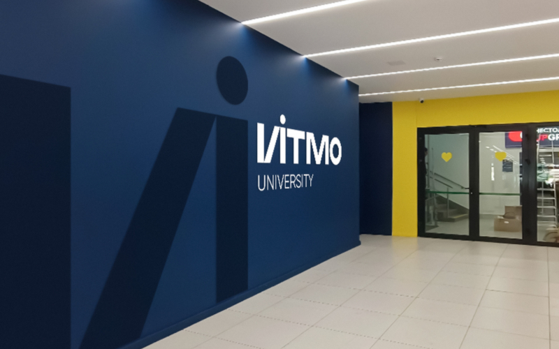
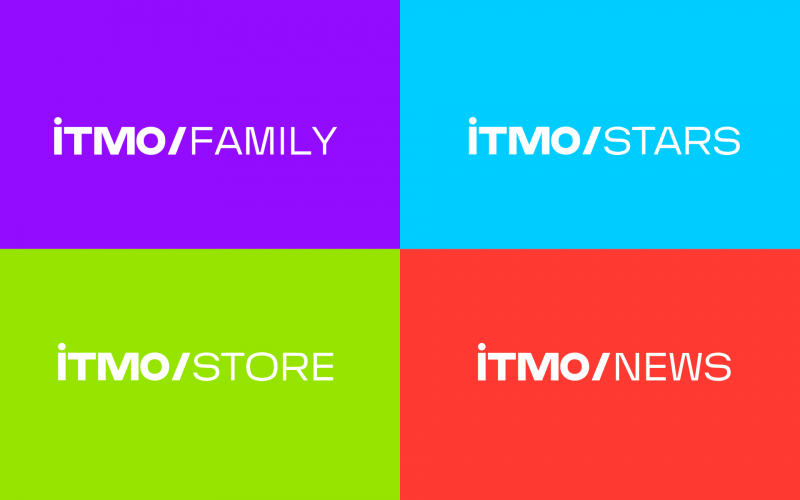
The logo became more simplistic and eye-catching – the university’s short name represents its self-sufficient ecosystem. The word “university” won’t go anywhere and will be used in materials for applicants and in educational programs and project descriptions. The sub-brands, such as ITMO.Family, ITMO.NEWS, and ITMO.Start will now share the same style.
Credit: ITMO University.
Credit: ITMO University.
Credit: ITMO University.
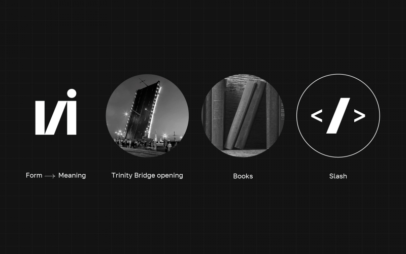
Thanks to minimalism, it will be easier to use the logo in various materials. There are black and white versions to make it more universal. The first letter is special: the letter I (И in Russian version) is associated with several concepts: drawbridges of St. Petersburg, books on a shelf that represent gaining new knowledge, and slash that stands for programming.
Credit: ITMO University.
In Russian, И is not only a letter but also the word “and”, which unites different concepts: science and technologies, study and work, theory and practice, dreams and actions. In English, many words that are important to ITMO start with the same letter, such as idea, innovation, and inspiration.
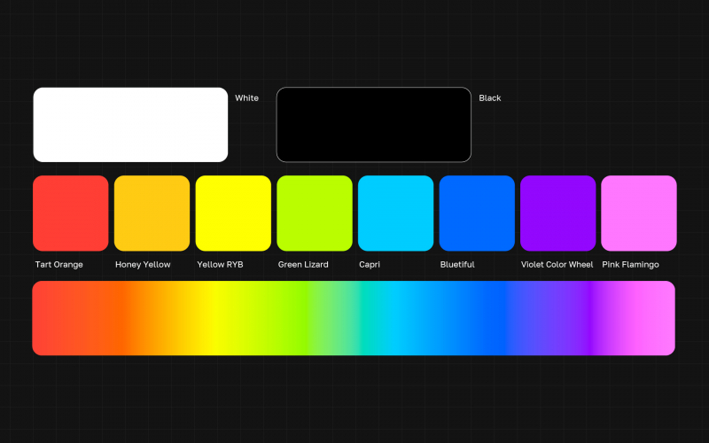
There are also more possible variations in terms of color: the new design allows you to use any color for the logo.
Credit: ITMO University.
What’s next
According to Kirill Alexandrov, the new style doesn’t only represent ongoing changes but also lays the groundwork for the future. The university’s team will work on achieving ambitious goals as part of the Development Strategy. Among them is the acceleration of scientific and technological breakthroughs, reaching higher technology readiness levels (TRL 7-8), as well as a systematic implementation of strong AI technologies and the development of industrial connections. The new look will help the institution communicate with different target audiences.