QGIS
Maps are a unique tool that allows us to uncover patterns, confirm existing theories, and popularize research results. They are simultaneously both an element of research methodology and a way of visually presenting research results.
QGIS is a geographic information system (GIS) with an open-source code. It works on Linux, Unix, Mac OS X, Windows and Android, supports a variety of vector and bitmap formats as well as databases, and has a large functionality.

The data the GIS works with has a very important feature – these are coordinates which are bound to every element of the map and allow to unmistakably identify an object in space. In their turn, the maps are characterized by a projection, which is a mathematical law that reflects how the Earth’s surface is transferred onto a plane.
QGIS is a free service where anyone can create their own map. The system’s only disadvantage is the limited opportunities for working with the map’s design. As noted by the workshop’s host Maria Podkorytova, the maps obtained via QGIS are more suitable for research work rather than presentation of results. However, you can export them and, having tweaked the design to your liking, present your research results to your colleagues, clients, or competition judges.

Emotion map: joy and grief in St. Petersburg
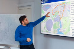
At her workshop, Maria Podkorytova also spoke about Imprecity – the project she is now working on. Its main idea is that any inhabitant of St. Petersburg can go on the website and map a specific place with an indication of the emotion they experience there.
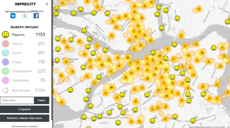
Specially for the workshop’s participants, Maria prepared a similar emotion map of the city, on which they learned to add layers, register marks in the database, display them and sort them based on different criteria, for example joy and anger, a user’s gender, whether the marks are old or now. The lecturer also explained how to transfer the data into a bitmap image in order to make the working map more representative.
“I believe that map-making skills come in handy in many fields, for example in sociology, urban studies, as well as all projects with spatial data, because a map essentially is a visual representation of data. This is indispensable in research work as it allows you to navigate a large array of data more quickly by means of visualisation. Today’s workshop was attended by amateurs who would like to familiarize themselves with a new technology. I presume that some of them are sociology researchers, because in sociological surveys there are quite a lot of situations where you need to immediately put respondents’ answers on a map to continue working with them dynamically,” shared Maria Podkorytova.